Sydney Opera House
December 2011
By Linda Badger
There are many advantages to creating a new version of something old. Audiences are familiar with the old, and love to see the creativity that a new artist can bring to the original. Graeme Murphy has created many brilliant, fresh interpretations of various classics for companies worldwide. He has successfully managed to take on this new season in his career with gusto, and the critics have been raving about his work.
In December, Murphy’s adaptation of Prokofiev’s Romeo and Juliet was showing at the Sydney Opera House. His long time collaborators shone throughout the work, with Akira Isogawa on costume design, Gerard Manion on sets and Damien Cooper managing lighting. Isogawa’s costumes were stunning. The use of colour, line, texture and concepts woven into each detail of every costume was art within itself. It brought new meaning to each character, and freshened up the entire look of the production. However, it felt at times like we were watching a fashion show. I felt major sensory overload. The costumes were just gorgeous, but they completely overtook and distracted from the choreography itself. It was a display of costumes with dancers in them, not costumes with the purpose of complimenting the choreography.
The most memorable performances were that of the characters of Romeo and Juliet played by Daniel Gaudiello and Leanne Stojmenov. Both wore fairly simple costumes, and therefore their movements were the focus. The company all danced well, but the dancing was just not as memorable as the costuming. This was highlighted with the addition of a random second wedding scene, set in a Bollywood style. This again was a chance to show off the talents of Akira Isogawa, but it didn’t necessarily add to the storyline, nor did it fit in with the cultural setting of the show.
One of the most interesting changes, although slightly out of context, was the addition of a holy man who married the fated lovers. He was portrayed as a Buddhist monk. Within the scenes that involved this holy man and his acolytes, we saw some of the most inventive choreographic moments. These scenes were mesmerizing, but they once again added a completely new culture to the mix, which didn’t really make sense.
I wondered the purpose of all these additions? In this case the additions were not in line with the story, the culture, or the setting of the ballet. If in the program there could have been some explanation for the choices Murphy made, we may have been able to piece together this work a little more easily.
Choreographically, Murphy’s use of motif for Juliet’s character was interesting. It seemed very well thought out and her interpretation of the role was undeniably realistic and mesmerising, taking us on her journey through the work seamlessly. Murphy’s reputation for bringing something special out of a dancer was brought to life in this casting.
The use of multimedia within the work was ingenious. With screens being an interwoven part of the setting, not an added extra, they helped make each scene come to life.
Death was added as a character, and he was fantastic, adding a new interpretation on the lead up to the character’s deaths. He made cameo appearances throughout the work, and the context within which Murphy weaved him into the story was clever. If every addition had this much relevance to it, it would have made the work that much better.
The most captivating scene was within the final moments of the work, where the two lovers both committed suicide to be with each other in eternity. Gaudiello and Stojmenov’s acting was realistic and they gave so much emotion in their portrayal of their characters. It was an awesome scene to observe. It really drew one in. In this moment the show took us back to the original version, and we were finally able to focus on the dance, the story and where the two were emotionally. Notably there were not the distractions of extravagant costumes or sets. The dancers felt more tangible, and their movement and role-play was what stood out.
This version of Romeo and Juliet is one that audiences either love or hate, or walk away confused with all the ideas that are thrown at them. I think Murphy definitely pitched this ballet at a contemporary audience. Lovers of the classic may leave the theatre feeling as if this revival was not justified. There were so many great ideas and concepts, but not every idea and concept needed to be used to make the show great. The original ballet was definitely in need of a revamp to make it attractive to the modern theatregoer who may not normally attend the ballet, so bravo to Murphy and collaborators for such a bold attempt at bringing to life a classic.
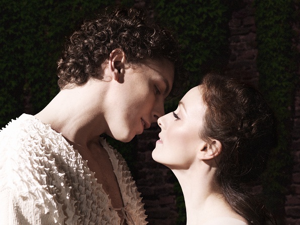
Photo: Kevin Jackson and Madeleine Eastoe of The Australian Ballet. Photo by Georges Antoni


